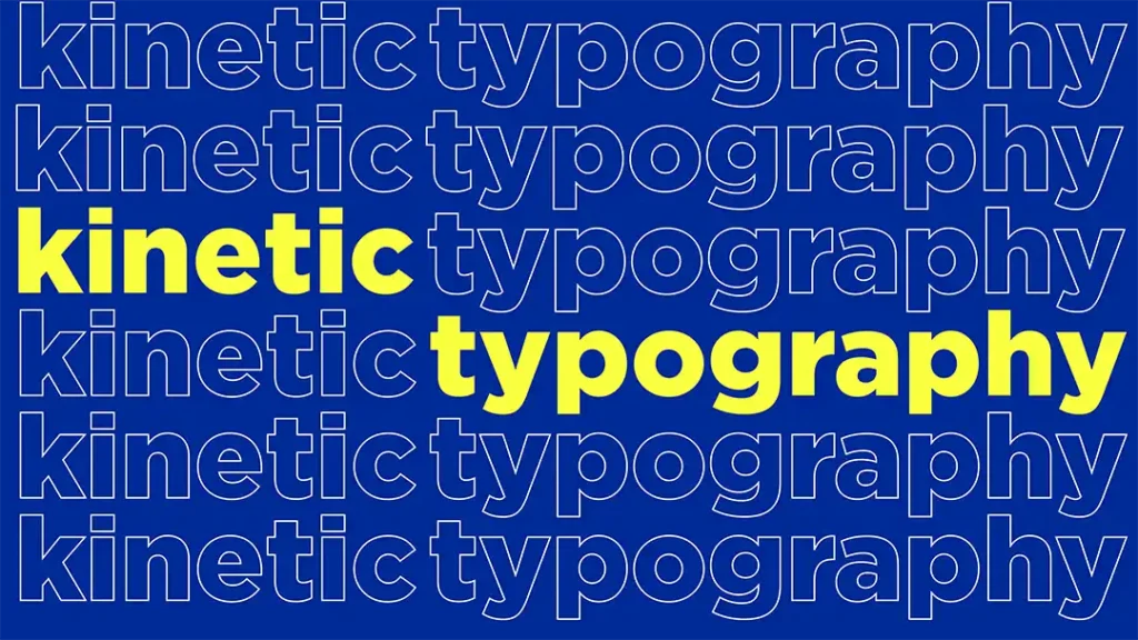
Kinetic Typography
Kinetic typography is the art of animating text to create dynamic, moving typography that communicates emotion, emphasis, and meaning beyond static words. By synchronizing animated letters and words with music, voiceovers, or sound design, it transforms written content into an engaging visual experience.
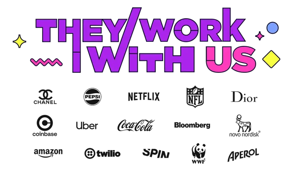
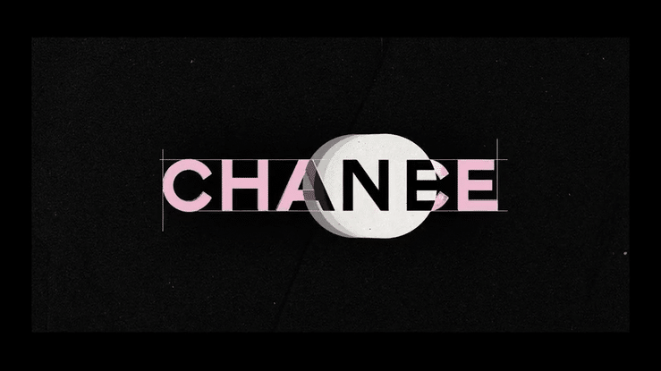
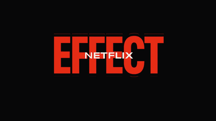
When Netflix needs kinetic typography that stops viewers mid-scroll. When Pepsi wants text that moves as boldly as their brand. When Chanel envisions animated text in a trendy perfume video, they turn to FEVR who knows that animated typography isn’t just moving text, it’s strategic brand storytelling.
Why Choose FEVR for Your Kinetic Typography Video?
- 7+ years mastering motion graphics – for brands that demand perfection
- Broadcast-quality animations – for any platform from social to Times Square
- Creative Precision – from concept to final frame, we hit the mark.
- 100% custom kinetic typography – for every letterform, movement, and transition
- Deadline-proof production – rapid turnaround without compromising quality
Our creative skills:
- Creative Direction, Graphic & Illustration – vibrant concepts and bold visuals
- Motion Graphics & Animation – dynamic stories that move with style
- Post-Production – Voice Over, Music, Sound Design & Audio Mix
- Premium production quality – that reflects your brand standards
- Brand Storytelling & Corporate Content – messages that connect with clarity
FEVR Kinetic Typography Portfolio Showcase
Our FEVR portfolio showcases amazing examples of kinetic typography inspired by a variety of ideas and designed to engage viewers. Each project is inspired by a unique idea, and these examples highlight the versatility and creative depth of kinetic typography.
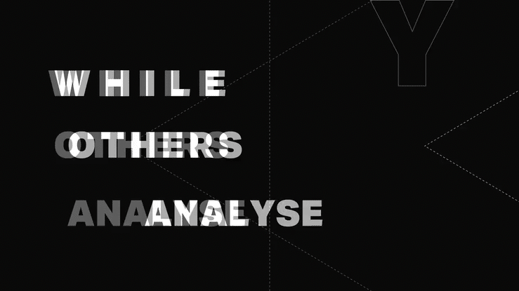
The designer’s vision and the technical expertise of animators are essential in bringing these kinetic typography projects to life, ensuring each animation is both visually striking and effective. For example for R15K AI, a pioneering predictive finance platform, we crafted a bold kinetic typography video that redefines fintech communication.
Strategic Motion Design Approach We don’t just animate text, we architect brand experiences. Every project begins with deep strategic thinking about your audience, objectives, and desired emotional response. Our kinetic typography serves your business goals, not just aesthetic preferences.
End-to-End Production Excellence From initial concept and storyboarding to final delivery, FEVR handles every aspect of kinetic typography production. Our team combines creative vision with technical mastery, using industry-leading tools like After Effects and Apple Motion to deliver broadcast-quality results, like this sports animation video we created for Run 4 Life.
The Evolution of Kinetic Typography in Modern Design
This comprehensive guide explores how kinetic typography has evolved into one of the most versatile and impactful tools in modern animation, capable of elevating everything from corporate presentations to blockbuster advertising campaigns. Kinetic typography developed from early film title sequences in 1959, with Saul Bass pioneering the use of animated type to enhance visual storytelling and set the stage for future innovations in motion design.
Understanding Kinetic Typography: Beyond Simple Animation
Kinetic typography, at its essence, is the art of animating text to convey meaning, emotion, and narrative beyond the literal words themselves. Unlike simple text animations that merely move letters from point A to point B, sophisticated treating each character, word, and sentence as a performer on stage, with timing, personality, and purpose. It can take various forms, including animated text, logos, and educational visuals, where different shapes and structures of text and symbols are used to create artistic effects and evoke emotions.
The roots of kinetic typography trace back to the 1960s film title sequences, where motion typography was used in film to enhance visual storytelling. Notably, the first feature film to extensively use this technique in its opening titles and title sequence was Alfred Hitchcock’s North by Northwest (1959), which pioneered the use of animated text to engage viewers from the very beginning. Today, it represents a convergence of graphic design, animation principles, and storytelling, where typography becomes cinema.
The psychological impact of moving text is profound. Static text requires cognitive effort to process, while kinetic typography can guide the viewer’s attention, control reading pace, and inject emotional context through motion. Each frame is carefully crafted to guide the viewer and capture the viewer’s attention. A word that appears gradually might suggest uncertainty or revelation, while text that bursts onto screen conveys excitement or urgency.
The brain processes moving elements faster than static ones, making kinetic typography particularly effective for capturing and maintaining attention in our increasingly distracted digital landscape. The growing popularity of it in branding, film, TV, and digital media highlights its increasing acceptance and use across various visual communication platforms.
The Creative Process: From Concept to Motion
The journey from static script to dynamic typography begins long before any animation software opens. Successful projects start with deep understanding of the message, audience, and desired emotional response. This pre-production phase involves treating the text like a script, identifying key moments, emotional peaks, and natural breathing points that will inform the animation’s rhythm. Designers and graphic designers play a crucial role in creating kinetic typography, ensuring that every element aligns with the intended impact.
Storyboarding becomes crucial, not just for visualizing the final product, but for mapping the emotional journey. Each word or phrase needs consideration: Which words deserve emphasis? Where should the viewer’s eye rest? How does the pacing support the overall message? This planning phase often reveals opportunities to enhance meaning through motion, perhaps a word literally “breaks” to show destruction, or text “builds” to demonstrate growth. As part of this process, designers continually develop new techniques and styles in kinetic typography, pushing the boundaries of what can be achieved with animated text.
Typography selection in kinetic work requires different considerations than static design. Fonts must not only align with brand identity but also perform well in motion. Some typefaces that appear elegant when static become illegible when animated, while others gain character through movement. Weight, spacing, and structural integrity all influence how text will behave during animation, making font choice a critical early decision. A dynamic layout is essential for effective kinetic typography, especially in web design, as it ensures that animated text elements interact fluidly and maintain visual engagement.
The concept of rhythm in kinetic typography parallels musical composition. Text has natural beats, pauses for breath, emphasis on key words, crescendos of meaning. Professional kinetic typography respects and amplifies these natural rhythms, creating a visual musicality that makes content more memorable and engaging. Animating text can be a fun way to bring branding to life, making messages more dynamic and emotionally resonant. This rhythmic consideration becomes even more critical when kinetic typography serves as support for voiceover, where the visual rhythm must dance with the audio rhythm without competing for attention.
Color and composition add another layer of meaning. Colors can shift to reflect emotional changes, while compositional elements can guide the eye through complex information. The interplay between foreground text and background elements creates depth and context, transforming simple words into rich visual landscapes that support and enhance the core message. Design studios often collaborate to produce a kinetic type piece, combining expertise in motion design, branding, and storytelling. Kinetic typography projects are produced using professional animation software such as Adobe After Effects and Apple Motion, which allow for the creation of dynamic and engaging animated text. Popular styles include scrolling typography and kinetic typography animations, which offer engaging ways to animate text and captivate viewers.
Design Strategies for Maximum Impact
The most successful projects achieve perfect harmony between animation style and message content. A luxury brand requires different motion language than a tech startup, where luxury might favor smooth, controlled movements that suggest sophistication, a startup might embrace energetic, unpredictable animations that communicate innovation and disruption. Using a strategic colour palette in these animations can attract attention and deliver a powerful message, as different colours can guide viewers’ focus, create visual interest, and enhance emotional impact, making the visuals more engaging and memorable.
Creating emotional resonance through motion requires understanding the psychological associations of different types of movement. Upward motion suggests growth and positivity, while downward movement can imply decline or grounding. Circular motions feel organic and flowing, while sharp, angular movements suggest precision or aggression. Master practitioners layer these movement qualities to create complex emotional narratives within the typography itself.
In mixed media applications, kinetic typography serves as the bridge between live-action footage and graphic elements. Projects like FEVR’s “Running is Life” demonstrate how animated text can seamlessly integrate with real-world imagery, adding layers of meaning without feeling disconnected from the live-action content. The typography becomes part of the environment, appearing to exist within the filmed world rather than simply overlaid upon it. On a digital page, kinetic typography can enhance the visual appeal and help engage the target audience by making the content more dynamic and interactive.
When supporting voiceover, kinetic typography transforms into a visual interpreter of spoken words. The text doesn’t merely appear when spoken, it anticipates, emphasizes, and extends the vocal performance. Successful voiceover-supported kinetic typography often appears just before the words are spoken, priming the viewer’s comprehension, then uses motion to highlight emotional inflections and key concepts that might be missed in audio alone. The impact of these projects can be measured by the number of views they receive, reflecting their reach and effectiveness.
Future proof design strategies ensure that kinetic typography remains effective as trends evolve, allowing brands to maintain relevance and adaptability over time. In branding and rebranding efforts, the launch of a new brand often leverages kinetic typography to establish a modern identity, Burger King, for example, used dynamic animated text in its rebranding campaigns. Similarly, a single Apple product campaign utilized kinetic typography to communicate its carbon neutral message, demonstrating how motion design can reinforce brand values and messaging.

Fluid Typography: Pushing the Boundaries of Motion
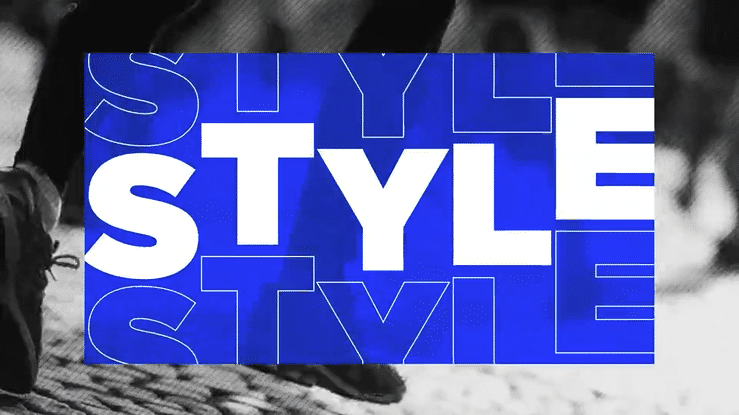
Fluid typography represents a bold evolution in the world of kinetic typography, where the transformation of letterforms becomes an art form in itself. Unlike traditional animated typography that moves text across the screen, fluid typography keeps words anchored in place while their shapes, sizes, and colors morph in mesmerizing ways. This animation technique creates a sense of continuous motion and visual interest, making it a favorite for music videos, title sequences, and promotional videos that demand a unique style.
By allowing typography to flow, stretch, and reshape, designers can convey complex ideas and emotions in an interesting way that static text simply cannot achieve. Fluid typography is particularly effective in scenes where the mood or message shifts, as the evolving letterforms visually represent change, growth, or transformation. This style of kinetic typography animation not only captures the viewer’s attention but also deepens the sense of narrative, making every word feel alive and purposeful.
Whether used to introduce a feature film, energize a music video, or add flair to a brand’s promotional content, fluid typography pushes the boundaries of what’s possible with motion and animation. It invites audiences to experience words as living, breathing elements of the story, creating a lasting impression that resonates long after the screen fades to black.
Psychology of Motion: How Kinetic Typography Drives Action
Kinetic typography is a catalyst for motivation, infusing words with energy and emotion that can move audiences to action. Through the creative use of motion graphics and animation, designers transform simple text into a dynamic force that inspires, excites, and empowers viewers.
By animating key phrases, highlighting core messages, and synchronizing movement with music or voiceover, kinetic typography videos become more than just visual content, they become rallying cries for brands, causes, and communities. The sense of movement and rhythm inherent in kinetic typography helps convey complex ideas in a way that feels accessible and compelling, making it easier for viewers to connect with the message on an emotional level.
For brands and organizations, incorporating kinetic typography into their video marketing strategy is a proven way to inspire audiences and leave a lasting impression. Whether it’s a motivational quote, a call to action, or a brand slogan, animated typography brings words to life, turning them into powerful tools for change and inspiration.

Industry Applications & Case Studies
In advertising and commercial applications, kinetic typography serves as both information delivery and brand expression. The animation style becomes part of the brand language, creating recognition and emotional connection that extends far beyond the immediate message. A well-crafted kinetic typography video can serve as an example of effective branding, showcasing how motion and text together embody the brand’s personality and values.
The entertainment industry, particularly film and television, has elevated kinetic typography to an art form. Title sequences now serve as miniature films in their own right, using animated text to establish mood, introduce themes, and prepare audiences for the viewing experience. Notable scenes, such as the opening of “The Office” or the iconic “I’m as mad as hell” scene from “Network,” use kinetic typography to heighten emotional impact and storytelling. These applications demonstrate kinetic typography’s capacity to function as pure storytelling, where the words themselves become characters in the narrative.
Event applications, such as FEVR’s work for Netflix Upfronts and Twilio Signal, showcase kinetic typography’s power in live environments. These projects are a great example of how kinetic typography can be adapted for large-scale displays, demanding typography that reads clearly from great distances while maintaining visual impact. The temporal nature of events, where audiences experience content in real-time without the ability to pause or rewind requires kinetic typography that communicates clearly and memorably in a single viewing.
Social media and digital marketing have created new constraints and opportunities for kinetic typography. Mobile viewing requires larger, bolder type treatments, while social platform algorithms favor content that captures attention within the first few seconds. These constraints have pushed kinetic typography toward more immediate, impactful approaches that communicate key messages before viewers scroll away.
Mixed media videos, particularly in advertising and branded content, represent the cutting edge of kinetic typography application. By integrating animated text with live-action footage, motion graphics, and other visual elements, creators build rich, layered experiences that engage multiple processing centers in the viewer’s brain. Recent campaigns have provided amazing examples of kinetic typography in action, demonstrating how this approach can elevate both storytelling and branding. The result is content that feels more immersive and memorable than traditional single-medium approaches.
The versatility of kinetic typography means it adapts to serve whatever story needs telling, whether that’s explaining complex technology, building emotional connection with a brand, or simply making information more digestible and engaging. As digital communication continues to evolve, kinetic typography remains one of the most powerful tools for cutting through noise and creating meaningful connections between messages and audiences.