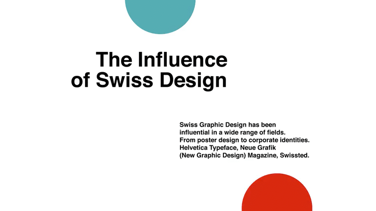
The influence of Swiss Design in motion graphics
Swiss Design, also known as Swiss Style or the International Typographic Style, is a graphic design style that emerged in Switzerland in the 1950s. Designers like Armin Hofmann, Emil Ruder, Josef Müller-Brockmann, and Max Bill were among the leading figures in this movement. It is characterized by a clear, concise, and objective approach to communication, often utilizing a grid-based layout, sans-serif typography, and a strong focus on minimalism and clarity. Its distinctive features have made it a recognizable and impactful style in various domains, from graphic design to architecture. Here are some key principles that define Swiss Design.
Swiss Graphic Design has been influential in a wide range of fields, from poster design and book design to corporate identities, and continues to significantly influence modern graphic design. Here are a few examples of some major pieces and projects created in the Swiss Style:
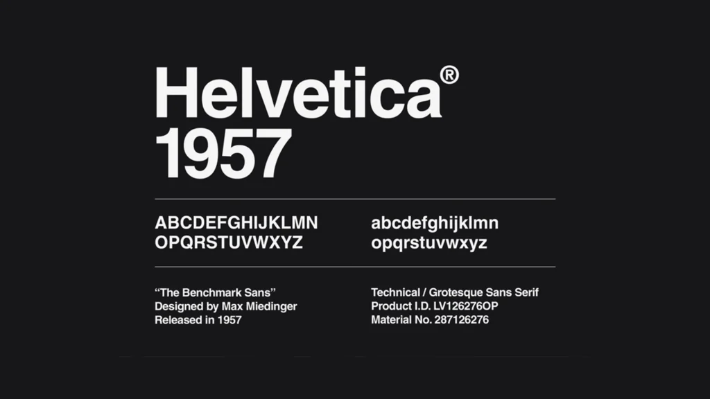
Helvetica Typeface: Helvetica was originally called Neue Haas Grotesk and was designed in 1957 by typeface designer Max Miedinger and Eduard Hoffmann, the president of the Haas’sche Schriftgiesserei (Haas Type Foundry) in Basel, Switzerland. Helvetica is perhaps one of the most recognizable and widely used sans-serif typefaces globally. It embodies the characteristics of Swiss Design with its clean, legible, and neutral look.
Swissted, Vintage rock posters remixed and reimagined in motion graphic:
Launched by the New York-based graphic designer Mike Joyce who reimagined vintage punk, hardcore, new wave, and indie rock show flyers into international typographic style posters. We collaborated with him to remix and reimagine all these vintage rock posters in motion graphics to create the well-known Swissted video. This video is notable for its blend of Swiss Modernism plus this incredible energy and rebellious spirit of punk and rock music.
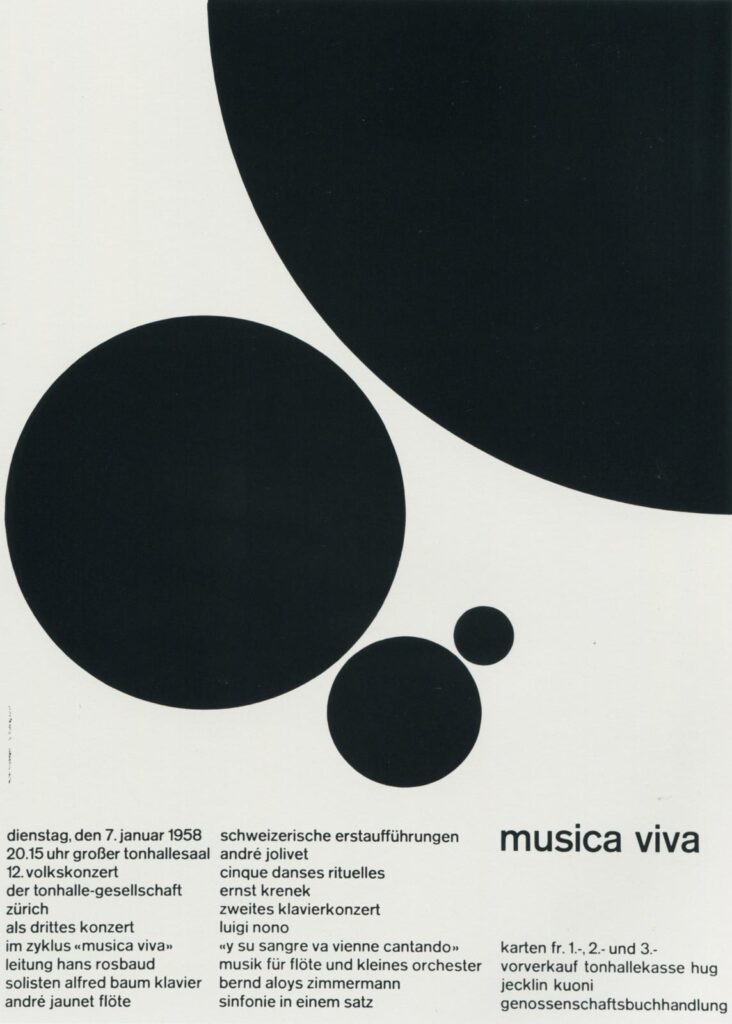
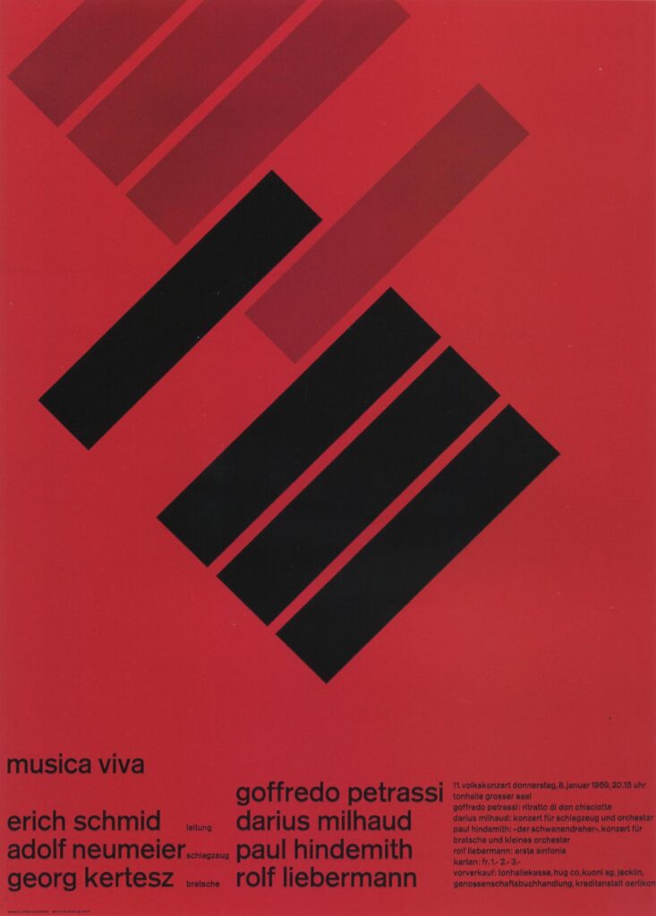
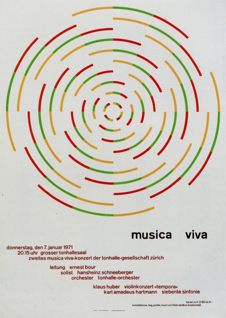
Musica Viva Poster Series: Armin Hofmann was another major figure in Swiss Design. His Musica Viva poster series is an excellent example of the Swiss Style’s design principles, particularly its use of simple forms and typography to convey information effectively and elegantly.
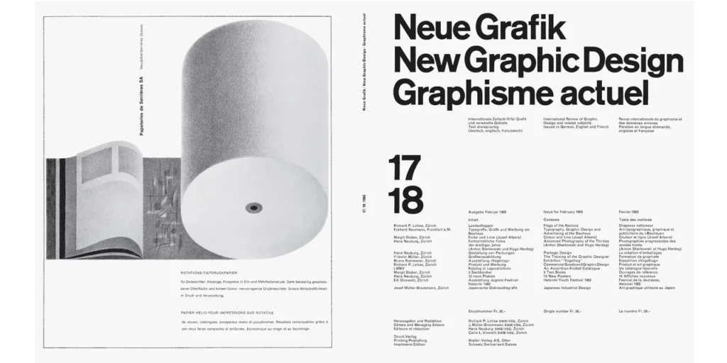
Neue Grafik (New Graphic Design) Magazine: Josef Müller-Brockmann, along with Richard Paul Lohse, Hans Neuburg, and Carlo Vivarelli, published this Neue Grafik influential design journal, which played a critical role in disseminating the principles of Swiss Design internationally.
The key features of Swiss design

The Swiss Design approach leans towards minimalism, eliminating any superfluous elements and highlighting only the essential components, which results in a neat, functional aesthetic.
Grid System: Central to Swiss Design is the grid system – a structured framework that ensures consistency and alignment. This system not only maintains visual harmony but also facilitates efficient information organization. Each element finds its place within the grid, resulting in layouts that are both orderly and visually appealing.
Sans-Serif Typography: Clean and legible sans-serif typefaces are hallmarks of Swiss Design. Fonts like Akzidenz-Grotesk and Helvetica, born from the mind of Swiss designer Max Miedinger in 1957, encapsulate this style. The preference for sans-serif fonts stems from their neutral appearance and ease of reading.
Minimalism and Functionality: Swiss Design adheres to the philosophy of “less is more.” It champions minimalism by stripping away extraneous elements and focusing on the essentials. This not only creates a visual impact but also enhances functionality. The ethos is to communicate the message directly and efficiently.
Objective Communication: Swiss Design rejects personal expression in favor of objective communication. It removes subjectivity, allowing the design to transcend cultural and individual biases. The clarity and straightforwardness of Swiss Design make it a universal language of visual communication.
Photography over Illustration: In the pursuit of precision and objectivity, Swiss Design often incorporates photography as a primary visual element. Photographs are seen as accurate representations of reality, aligning perfectly with the style’s emphasis on clarity.
Asymmetry with Balance: While Swiss Design leans towards asymmetry, it maintains a delicate balance. This asymmetrical harmony guides the viewer’s eye through the composition, creating a dynamic yet controlled visual experience.
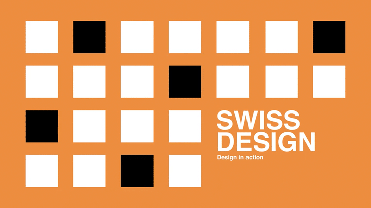
Swiss Design in Action: From Posters to Brands
Swiss Design’s impact reaches far beyond its origins, influencing various artistic realms. From corporate identities to album covers, Swiss Design’s legacy endures.
Corporate Identity: Swiss Design’s principles of clarity and minimalism have found a natural home in corporate branding. Icons like IBM, Microsoft, and American Airlines have adopted Swiss Design elements in their logos, resulting in timeless and recognizable visual identities. Even if these logos were not designed in Switzerland or during the peak period of the Swiss Design movement, they all share a simplicity, legibility, and neutrality that align with its principles.
Essentially, the precepts of Swiss Graphic Design – including simplicity, minimalism, readability, and the use of grid layouts – have been applied to many corporate logos and brand identities. These principles make brands easily recognizable and consistent across different platforms, both of which are crucial for effective branding. Here are some examples:
IBM: The IBM logo, designed by Paul Rand, is a prime example of Swiss Design principles. The clear, sans-serif typeface (City Medium) and the horizontal stripes (which suggest “speed and dynamism”) create a simple, clean, and instantly recognizable logo. The logo’s structure is very grid-like, in keeping with the Swiss Design style.
American Airlines: Massimo Vignelli, an Italian designer heavily influenced by Swiss Design, created the American Airlines logo in 1967. It features a highly simple, readable, sans-serif typeface (Helvetica), with a stylized eagle between the two words. While American Airlines rebranded in 2013, Vignelli’s design is still recognized as an iconic example of Swiss Design in branding.

Speculating the Evolution of Swiss Design

Swiss Design has remained consistently influential since its inception in the mid-20th century due to its focus on clarity, legibility, and the use of grid-based layouts. These principles have proven to be timeless and are frequently used in various design fields, from graphic design to web design and beyond.
Swiss Design stands as a testament to the power of clarity, simplicity, and functionality in the world of art and design. Its legacy lives on in the works of countless designers who continue to draw inspiration from its principles. As we approach 2030, the journey of Swiss Design continues, shaping aesthetics, enhancing communication, and influencing creative minds worldwide. In the context of increasing digitization and the proliferation of screen-based interfaces, the principles of Swiss Design could become even more prevalent.
