Helvetica: The Font that Revolutionized Design
Helvetica is a widely used sans-serif typeface known for its clean, simple, and modern appearance, making it a popular choice for various design projects, including signage, branding, advertising, print media and of course motion graphics. The font’s neutrality and legibility have contributed to its enduring popularity across different applications and industries.
What is Helvetica? A Brief History
Helvetica originated in the 1950s in Switzerland, where it was developed by Max Miedinger and Eduard Hoffmann at the Haas’sche Schriftgiesserei (Haas Type Foundry). The new font was initially named “Neue Haas Grotesk” but was later renamed “Helvetica” in 1960 by the Linotype Corporation, which was responsible for its distribution outside of Switzerland.
Helvetica quickly gained popularity due to its clean, modern design and its versatility in various design applications. As one of the most popular typefaces, it became especially prominent during the mid-20th century as part of the International Typographic Style, also known as the Swiss Style, which emphasized simplicity, clarity, and objectivity in design.
Over the years, Helvetica has undergone several revisions and adaptations to meet the evolving needs of designers and advancements in technology. Variants such as Helvetica Neue, which includes additional weights and styles, were introduced to expand its versatility. Digital versions of Helvetica have also been developed to ensure its compatibility with modern digital platforms and printing techniques. Despite the emergence of numerous alternative typefaces, Helvetica remains one of the most widely used and recognizable fonts in the world, with its timeless design continuing to influence typography and graphic design.
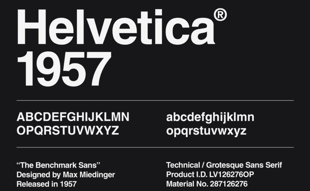
Helvetica worldwide recognition:
It’s one of the most widely used typefaces globally, known for its clean and modern appearance. With the introduction of Neue Helvetica World, its neutrality and legibility have been further enhanced, making it suitable for various languages and cultures, contributing to its widespread adoption across different countries and industries.
For example in public transportation signage including NYC, the London Underground or the Berlin U-Bahn in Germany. Many print media magazines such as Vogue, Elle, and Esquire often use Helvetica in their layouts and headlines for its readability and contemporary look. The major tech companies like Microsoft, Apple, and IBM have used Helvetica in their user interfaces, product packaging, and marketing materials, reflecting its association with modernity and innovation.
Helvetica has been featured prominently in film posters for movies such as “The Social Network, and “The Dark Knight,” conveying a contemporary and stylish aesthetic. The font is often used in promotional materials and signage for art and design exhibitions, galleries, and museums due to its clean and minimalist appearance, or in fashion industry. High-end fashion brands like Chanel, Balenciaga, and Calvin Klein have used Helvetica in their advertising campaigns, showcasing its versatility and sophistication. The same for The North Face, American outdoor apparel and equipment company renowned for its durable and high-performance products.
Helvetica’s digital adaptability refers to its ability to seamlessly transition from traditional print media to digital platforms. As technology has advanced, Helvetica has been optimized for use in digital environments such as websites, mobile applications, and digital displays. This adaptability is crucial in maintaining the font’s visual integrity and legibility across different screen sizes, resolutions, and devices. Designers and developers can access digital versions of Helvetica optimized for screen rendering, ensuring crisp and clear typography on digital screens. Additionally, Helvetica’s clean and straightforward design translates well to digital interfaces, where readability and usability are paramount.
Moreover, Helvetica’s digital adaptability extends to its compatibility with various software applications and operating systems, allowing designers to work with the font seamlessly in their digital design workflows. This flexibility makes Helvetica a preferred choice for digital design projects, where its timeless aesthetic and universal recognition continue to shine in the digital realm.
4 major examples of Helvetica being used in various contexts:
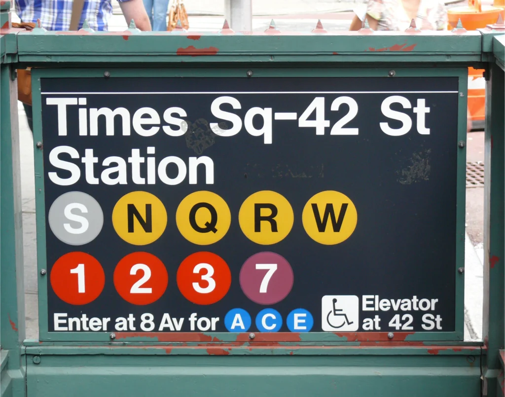
- New York City Subway Signage: Helvetica is the primary typeface used in the signage of the New York City subway system. It is employed for station names, directional signs, informational posters, and other printed materials throughout the subway system’s extensive network. The font’s clarity and legibility make it ideal for conveying important information to millions of commuters and visitors navigating the subway system each day.
- United States Postal Service (USPS) Mailboxes: Helvetica is commonly used on United States Postal Service (USPS) collection boxes, which are ubiquitous fixtures in urban and suburban areas throughout the United States. The font is utilized for the prominent “U.S. MAIL” lettering on the front of the boxes, as well as for informational text and instructions regarding postage and mailing regulations. Its clear and straightforward design ensures that important postal information is easily readable to customers.
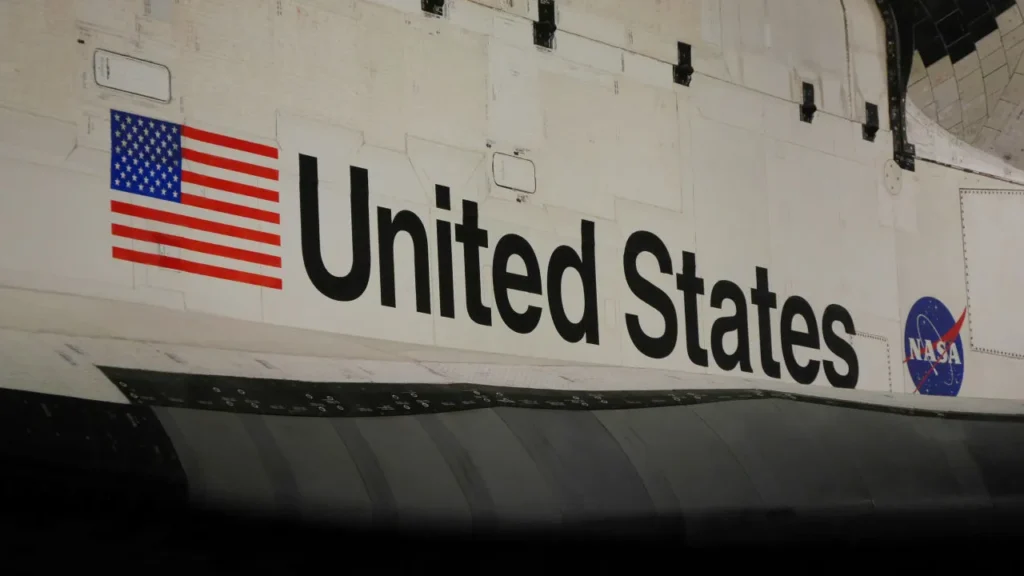
- NASA Space Shuttle Signage: The Helvetica® typeface has been used by NASA extensively for decades. On the exterior of NASA’s Space Shuttle fleet, including the iconic “United States” wordmark on the orbiter’s payload bay doors. The use of this minimalist sans serif font on the Space Shuttle conveyed a sense of modernity and professionalism, reflecting the advanced technology and scientific expertise associated with NASA’s space exploration missions.
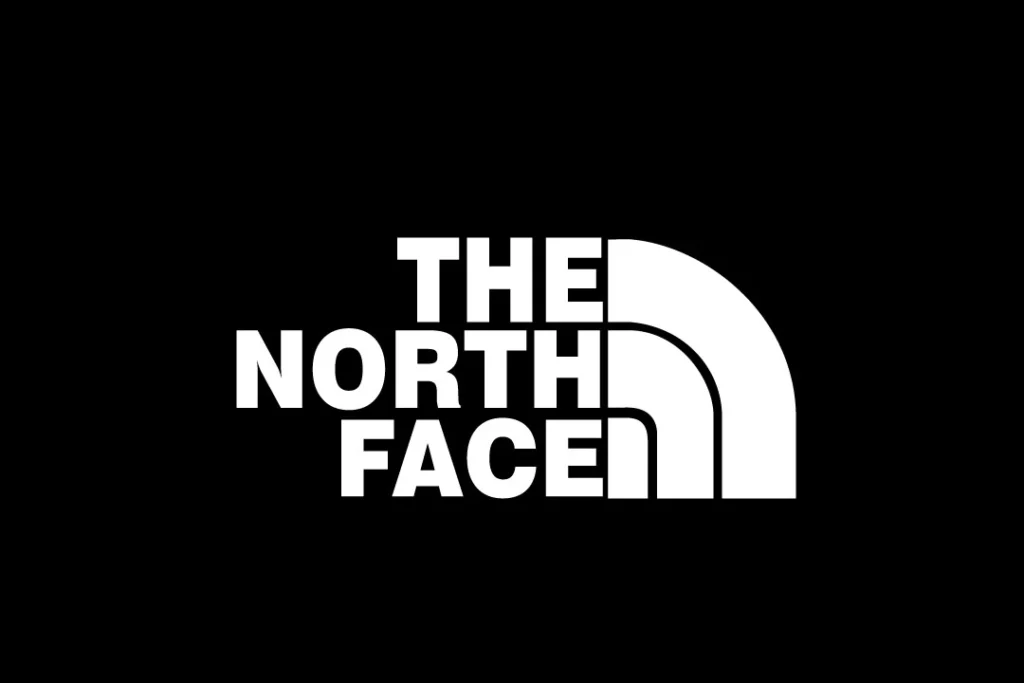
- The North Face Branding: The North Face, a popular outdoor apparel and equipment company, incorporates Helvetica into its logo and branding materials. The company’s logo typically features the name “The North Face” set in bold uppercase letters, with “The” and “Face” spaced slightly apart to create visual interest. Helvetica’s clean and versatile design aligns with The North Face’s emphasis on functionality, durability, and exploration in the great outdoors.
The power of typography for the future
Helvetica’s journey from its origins in Swiss design to its widespread adoption in the digital age is a testament to its enduring influence and adaptability. As a timeless and versatile typeface, Helvetica continues to shape the visual landscape across print and digital media, inspiring designers, artists, and
communicators worldwide. Its legacy serves as a reminder of the power of typography to transcend cultural and technological boundaries, leaving an indelible mark on the world of design.
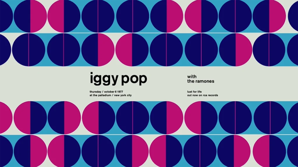
We are thrilled to conclude this article with Swissted, an animated tribute celebrating the timeless elegance of Helvetica font alongside the iconic music bands of the 70s and 80s. With Swissted, we’ve embarked on a journey where rock posters from yesteryears are not just reimagined but brought to life through captivating motion graphics. It’s a homage to both the rich history of design and the enduring influence of Helvetica, seamlessly blending nostalgia with modern creativity.