SWISSTED vintage posters in Motion Graphics
Swissted: A Motion Graphics and Rock Tribute by FEVR Studio
With this Motion Graphics tribute, we celebrated the emblematic Akzidenz-Grotesk typeface and the legendary music bands of the 1970s and 1980s, two cultural icons that, on the surface, come from completely different worlds, yet share a deep connection through visual identity and attitude. This vintage-style video was crafted with a unique blend of Swiss design aesthetics and smooth, contemporary animation techniques, bringing to life the timeless influence of both modernist design and rock music.
Through this project, we wanted to not only showcase the precision and simplicity of Swiss typography but also capture the raw energy, rebellion, and creative freedom that defined the punk and rock scenes of that era. Each frame was carefully designed to pay homage to this dual heritage.

Remixing Vintage Rock Posters with Bold Motion Graphics
At FEVR Studio, we remixed and reimagined these iconic vintage rock posters through the lens of motion graphics, giving them a new dynamic life. What makes this video stand out is its bold fusion of Swiss Modernism known for its strict grid systems, minimalist compositions, and typographic clarity with the untamed, anti-establishment spirit of punk and rock music.
This creative collision brings something fresh and unexpected to both design and music lovers: it’s where the rigor of design theory meets the spontaneity of underground culture. The clean geometry of Swiss graphics juxtaposed with the gritty roots of rock creates an aesthetic that’s as compelling as it is unconventional, a visual remix that resonates with designers, animators, musicians, and creatives alike.

How Music and Motion Graphics combine to Create a Visual Experience
We also wanted to produce a custom-made soundtrack featuring short clips and soundscapes that evoke the memory of these iconic rock songs. Sound is a crucial part of any visual storytelling project, and for us, it was essential that the music reflect the vibrancy and rebellious spirit of the bands whose posters we animated.
And that’s how this amazing project started with the desire to not only visualize but also sonically celebrate the cultural impact of punk and rock music. This layer of sound design gives the animation more than just motion it gives it soul. Each beat, rhythm, and transition was carefully aligned with the visuals to create a multi-sensory homage that speaks to music fans and design enthusiasts alike.

From Punk Flyers to Swiss Minimalism: The Visionary Work of Mike Joyce
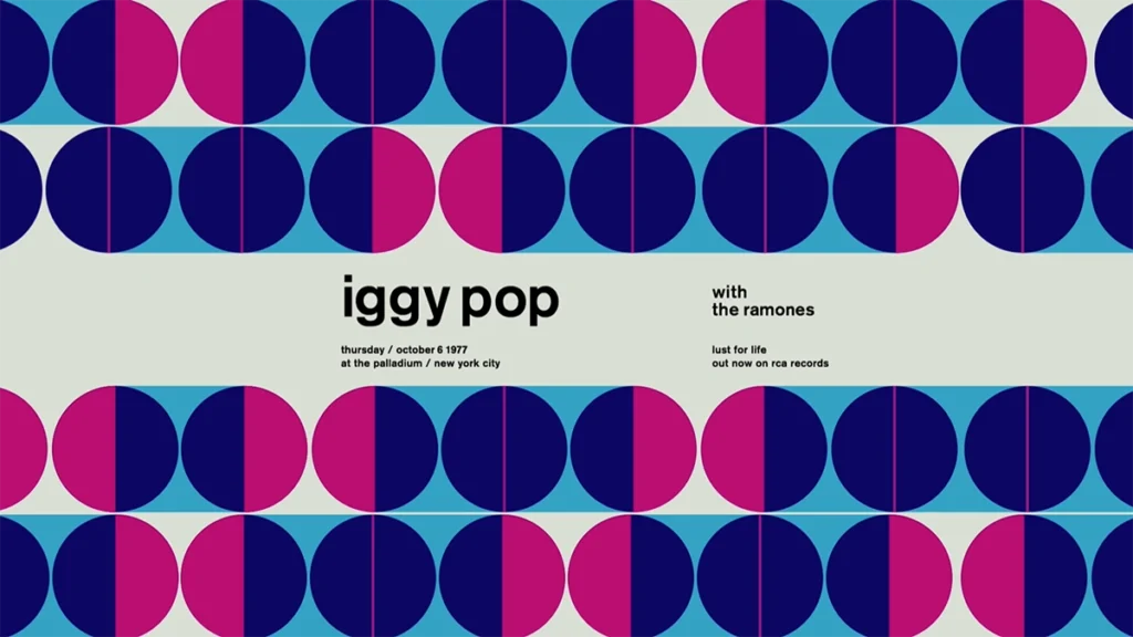
The visuals were originally created and illustrated by Mike Joyce, a renowned New York-based graphic designer and lifelong rock music fan. Mike is celebrated for his album cover designs for artists like Katy Perry, Iggy Pop, and many other iconic musicians. But it was his passion for both rock music and Swiss design that led him to create Swissted, the project that inspired our animated version.
In Swissted, Mike transformed the gritty, often chaotic flyers from the punk rock scene of his youth into elegant, meticulously Swiss design posters. His work highlights the possibility of finding beauty, structure, and modernist elegance in the most unlikely places. His ability to reinterpret the visual chaos of punk through the lens of Swiss design is what makes his art so unique and enduring.
Blending Order and Chaos: The Visual Language of Swissted Posters
Each poster expresses a new aesthetic language using strict lines, colorful geometric shapes, overlapping patterns, and subtle transparency effects, all meticulously composed with text set in Berthold Akzidenz-Grotesk Medium, one of the foundational typefaces of modern graphic design. These visual choices are not accidental, they pay tribute to the precision and philosophy of Swiss graphic design, which emphasizes clarity, order, and functionality.
Some standout examples of Swissted posters include vibrant reinterpretations of legendary punk and rock concerts by bands such as The Ramones, Blondie, David Bowie, and Nirvana. By putting these underground icons into a clean and structured design system, the work challenges the boundaries between high design and street culture, order and chaos, minimalism and maximalism.

How Bold Typography and Minimalist Layouts Bring Swissted Posters to Life
These posters feature bold typography, clean lines, and a minimalist layout, all unmistakable hallmarks of Swiss design principles. The use of Helvetica font, itself a product of the Swiss design movement, plays a key role in unifying the aesthetic, bringing both visual harmony and typographic history into the narrative.
By applying this timeless aesthetic to classic punk rock imagery, Swissted creates visually stunning pieces that pay homage not only to the music but also to the modernist design movement that revolutionized how we communicate visually. The result is a beautiful paradox: vintage music and contemporary design, grunge and minimalism, static posters and dynamic animation, all merged into one fluid creative expression.

👉 To see more examples of Motion Graphics Videos animations we’ve done, you can check out Swissted, PepsiCo, School House, Coinbase, Dior, Running.
👉 If you’re a designer, animator, or creative thinker, we invite you to share your portfolio with us. We’re passionate about pushing creative boundaries, and Swissted is just one example of how we bring bold ideas to life.
👉 Follow FEVR Studio on Pinterest for behind-the-scenes looks, inspiration boards, and upcoming projects where art, motion, and culture collide.