
I Love New York Logo History
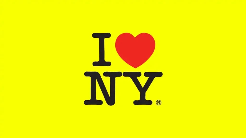

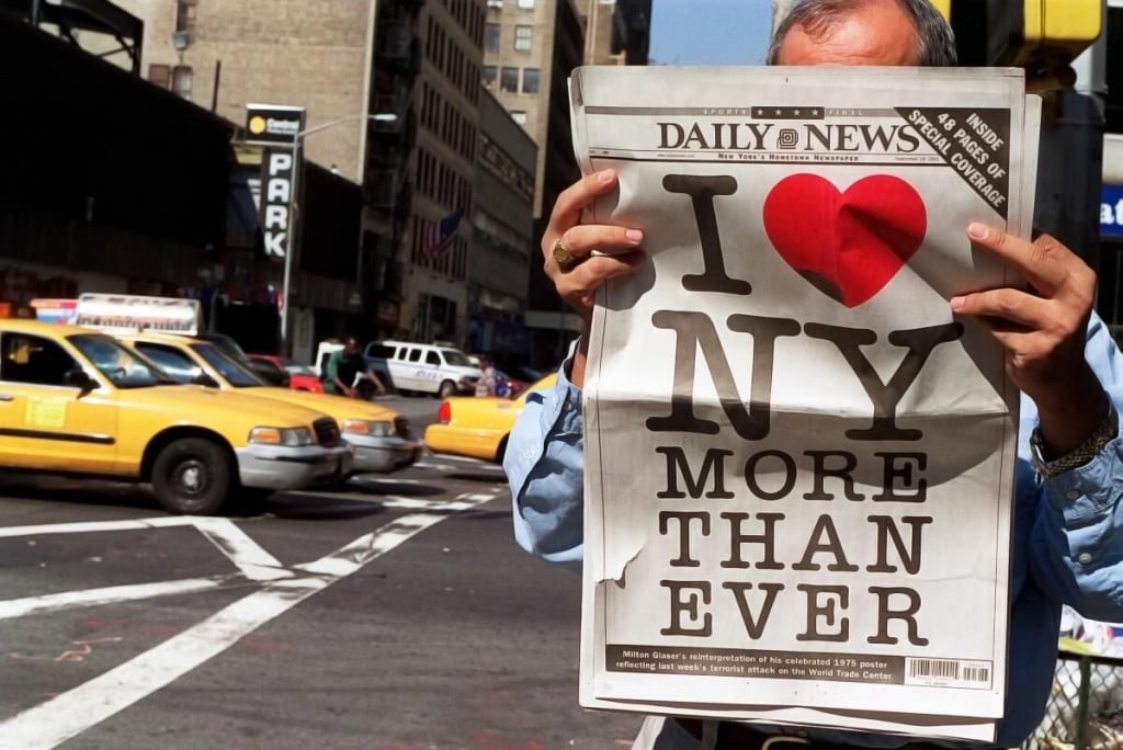
When you think of New York City, one symbol inevitably comes to mind: the iconic "I NY" logo. Created in 1977, this emblem has transcended its original purpose, becoming a global icon of both design and urban culture. From its initial role in a tourism campaign to its place in the broader world of graphic design, the "I NY" logo stands as a symbol of the city’s resilience, creativity, and spirit. Its story is not just one of marketing success but a case study in the power of simplicity, emotional resonance, and cultural impact.
Beyond its aesthetic appeal, the logo carries a rich history, offering lessons for modern designers, creatives, and communication professionals. It transcends time and trends, remaining relevant and inspiring in a world where visual culture is in constant flux. But what makes this design so compelling? And why should it matter to those working in graphic design, illustration, and visual communication today?raphy and illustration forms the foundation of a design that communicates not just visually, but emotionally., it becomes more than just an image, it becomes a part of culture.


The Birth of a Design Icon

Design Elements That Matter
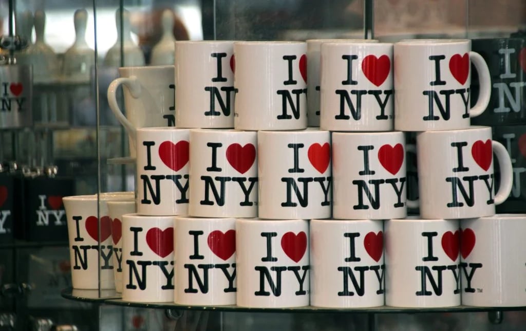
The "I NY" logo is a masterclass in simplicity and impact. Its success can be attributed to several key design elements that hold lessons for today’s graphic designers and illustrators.
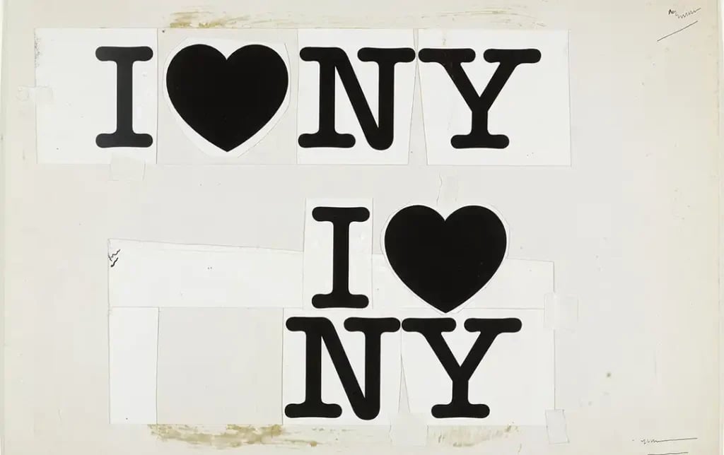
Simplicity and Clarity: One of the defining characteristics of the "I NY" logo is its simplicity. There is nothing superfluous in the design—just three letters and a heart symbol. This economy of elements allows the logo to communicate its message instantly and clearly. For graphic designers, the takeaway is that powerful design does not have to be complex. Simplicity often carries more weight, offering clarity in communication that is essential in both illustration and graphic work.
Emotional Connection: The heart symbol in the "I NY" logo is not just a decorative choice. It is a visual representation of love, an emotion that resonates universally. This emotional appeal makes the logo more than a piece of typography; it becomes personal. The ability to evoke emotion through design is a vital skill for any creative professional. Whether through the choice of color, form, or imagery, designers and illustrators should aim to create works that not only inform but also connect with their audience on an emotional level.
Cultural Impact: The "I NY" logo has permeated popular culture in ways that few designs ever do. It has been repurposed, reimagined, and even parodied across a wide array of contexts—from T-shirts to political campaigns. Its adaptability demonstrates the power of a strong, recognizable design to transcend its original function. For designers, this highlights the importance of creating work that can evolve and remain relevant in different cultural landscapes. A design that resonates across generations, as the "I NY" logo has, is a testament to its enduring relevance.
Brand Identity: The logo is now synonymous with New York City itself. It has shaped the city’s brand identity, transforming how both residents and tourists perceive it. Through this example, designers can understand the critical role that graphic design plays in branding. Effective design shapes how people interact with and perceive a brand, whether that brand is a company, a product, or an entire city.
A Modern Symbol for a New Generation
Despite being over four decades old, the "I NY" logo continues to inspire new generations of creatives. From streetwear brands to social media campaigns, it is constantly being reinterpreted. This ongoing reinvention underscores a crucial lesson for designers today: great design is timeless. While trends may come and go, the principles of simplicity, emotional resonance, and cultural relevance never fade. For young designers, illustrators, and graphic artists, the "I NY" logo offers a blueprint for creating work that stands the test of time.
In a world where visual culture is saturated with new content every day, it’s easy to get lost in the noise. The "I NY" logo cuts through that clutter, reminding us that at the core of every successful design is a clear and compelling message. Glaser’s design shows that the most effective visual communication often taps into something universal, whether it’s love, humor, or hope.


Lessons for Modern Graphic Designers and Illustrators
For those working in graphic design and illustration today, the "I NY" logo serves as an invaluable case study. Its success offers several lessons that remain relevant in the modern creative landscape:
- Clarity Above All: In an age of information overload, clarity is more important than ever. A strong design communicates its message immediately, without requiring excessive interpretation. Whether you’re working on a corporate identity, an illustration for a magazine, or a social media graphic, remember that simplicity often speaks loudest.
- Emotional Connection is Key: Effective design isn’t just about aesthetics; it’s about creating an emotional response. As the "I NY" logo shows, when a design connects on an emotional level, it becomes more than just an image, it becomes a part of culture.
- Versatility Equals Longevity: A successful design must be adaptable. The "I NY" logo has been reimagined countless times while retaining its core message. Designers today should aim to create work that is versatile enough to evolve and remain relevant across different platforms and generations.
- Design Shapes Identity: Whether for a city, a company, or an individual, design plays a crucial role in shaping identity. The "I NY" logo transformed how people view New York City. As a designer, understanding the power of visual communication to influence perception is critical.

Share a few details about your project.
We’ll take it from there.
Let’s talk?


325 Hudson St 4th Floor
New York, NY 10013
+1-212-710-5905
© - FEVR | Motion Graphics & Animation Video Production. All rights reserved - 2026
NEW YORK
1541 Ocean Avenue
Santa Monica CA 90401
LOS ANGELES
hello@wearefevr.com


